Yuko Shimazu Yuko Shimazu Yuko Shimizu

Award winning Japanese illustrator based in New York City and instructor at School of Visual Arts.

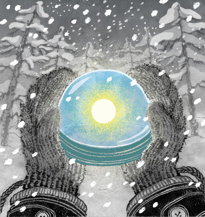
Happy Winter Solstice

I don’t like it when daylight savings time ends, and days get shorter and shorter. I get the annual winter blues.

Today is Winter Solstice. Yes, the shortest day of the year. And, there is something to celebrate: Look at the bright side, the day can only get longer from here on!

Well, of course, colder weather awaits in front of us in January and February. But I always feel like today is the day I can exhale and think that the worst has passed.

Happy Winter Solstice illustrationHave a very Merry Christmas, happy Chanukah, and whatever religious or non religious holiday you are celebrating. And, a happy new year.
See you again next year, everyone.

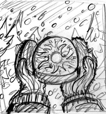
PS: This illustration was originally created for The Atlantic Magazine’s Gallery section, published in the middle of the horrible winter of 2011.

Happy Winter Solstice illustration sketch

Killed Job Of The Year 2011

Kill Job illustration 2011

It’s December. This is the time of the year when I look back and give the light of the day to the sadly killed jobs for one reason or another. Yap.

This year, it happened in January, and I knew immediately that it was going to be my “killed job of the year.”
My first TIME Magazine cover that never was.
Yap.

When TIME called and asked me to do an illustration, that, by itself, I was really excited. I have worked with TIME in past, but not so often, so phone call from them is always exciting. I think the good thing was that when they initially said ‘half a page or full page” later turned into “maybe possibly cover”, then “maybe possibly a cover and interior illo”, I didn’t take it too seriously.

Oh of course, I did take the job very seriously. But I have worked long enough to know not to keep my hopes too high when I hear something that sounds just too good to be true. (Although, I know Tim and Edel and a few others here on Drawger have done multiple TIME covers in past. For me, it is still a dream. And I am in peace with it. )

When eventually, the magazine has decided to go with a photo for the cover, I wasn’t surprised. The photo felt more like TIME to me anyway.

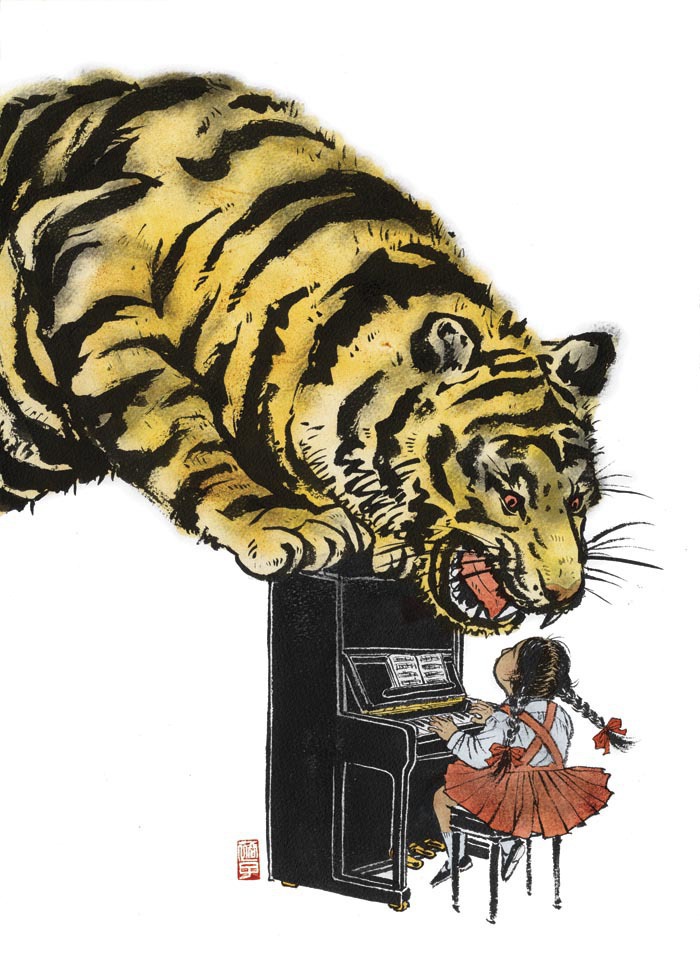
It was a bit sad when eventually neither of my illustrations got published. But hey, the one with the tiger and piano got accepted into both American Illustration and Society of Illustrators annual, and then published in my first monograph (I will talk about this book some other time). I cannot ask for more. Thank you Andree Kahlmorgan and Emily Crawford for giving me an opportunity to work on an image that I am really proud of.

Kill Job illustration 2011 sketch

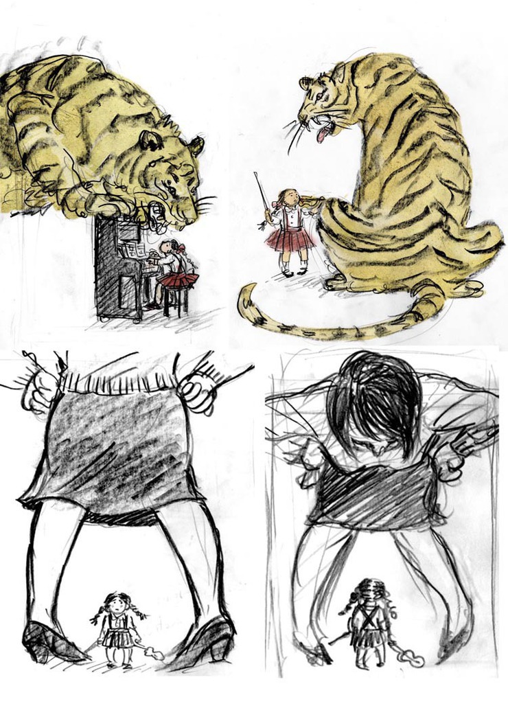
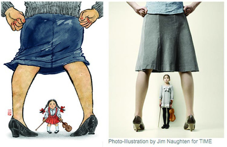
It was an article about tiger mothers. Remember, it was all the rage in early 2011? So, initial cover ideas were on top, drawing actual tiger. Then they asked me to draw the big mother and small daughter, which would look great as photos, but not so interesting as illustrations, I thought.


Kill Job illustration 2011 another illustration

I found the image on the right on TIME website. Works so much better in photo than illustration, I think.


Kill Job illustration 2011

This was my pitch for the cover, and although killed, I am still very happy with the image. Most of the illustrations I do have a lot of details, but I am a big fan of simple graphic image.


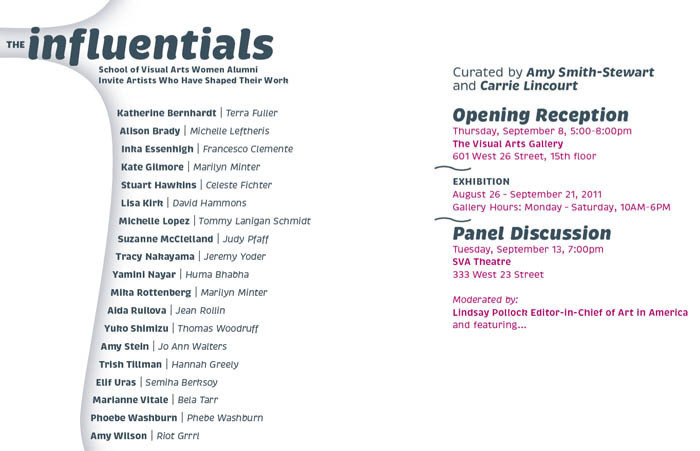
The Influentials

The Influentials small image

Tomorrow evening at The Visual Arts Gallery is an opening for a show The Influentials. It is a show of SVA female alumni and their mentors showing works together side by side. I don’t know how I got to invited to be in this show of mainly fine artists, many of them very established, but anyway, I will be showing, together with Thomas Woodruff, who was my undergraduate illustration instructor, then grad school personal advisor, and currently my boss/chair at BFA Illustration program where I have been teaching since 2003.

I wasn’t sure what to show at first. I wanted to show something I hadn’t shown anywhere, which, in process, is not illustration.

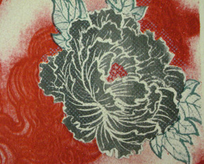
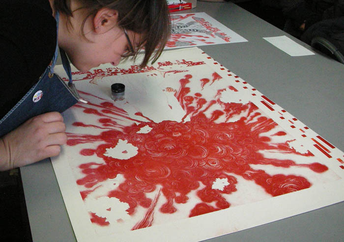
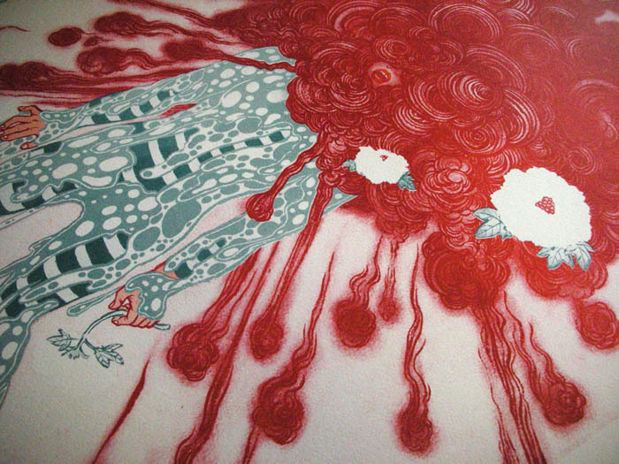
When last severely cold winter was getting started, University of the Arts kindly invited me to participate in the Von Hess Artist Residency, to create a limited edition multi separation offset print with the master printer Amanda D’Amico. Since the print got finished, I was looking for an opportunity to show. So, this will be what I will be showing. Without Amanda’s literary ‘master’ skill, I would have never be able to make this 6 color separation prints. Although the original image was created last year for Blowup show at the Society of Illustrators, this new version is nothing like digital print outs.

Opening reception is tomorrow. (invite on the bottom of this post).
If you have time, or if you are already planning on opening hopping at Chelsea’s new gallery season, please schedule a stop at The Visual Arts Gallery.

Big thank you to everyone at the gallery, everyone at UArts, especially Matt and Amanda, and Thomas Woodruff.

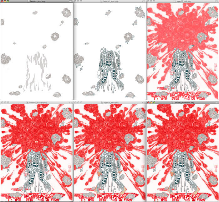
The Influentials process 1

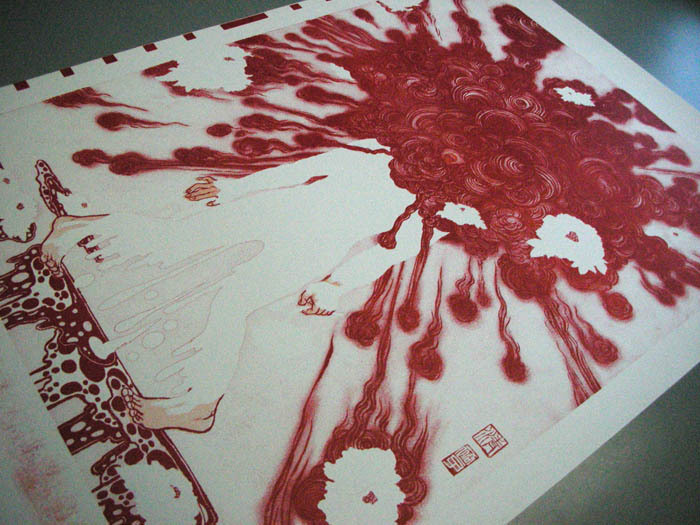
These are the six separations. 1)gray 2)blue gray 3)first red 4)second red 5)skin color 6)white dots for flowers


The Influentials process 2

The Influentials process 3

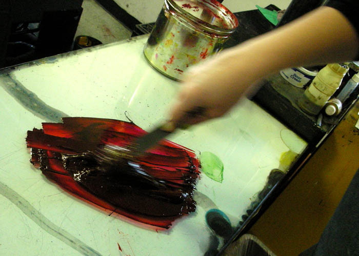
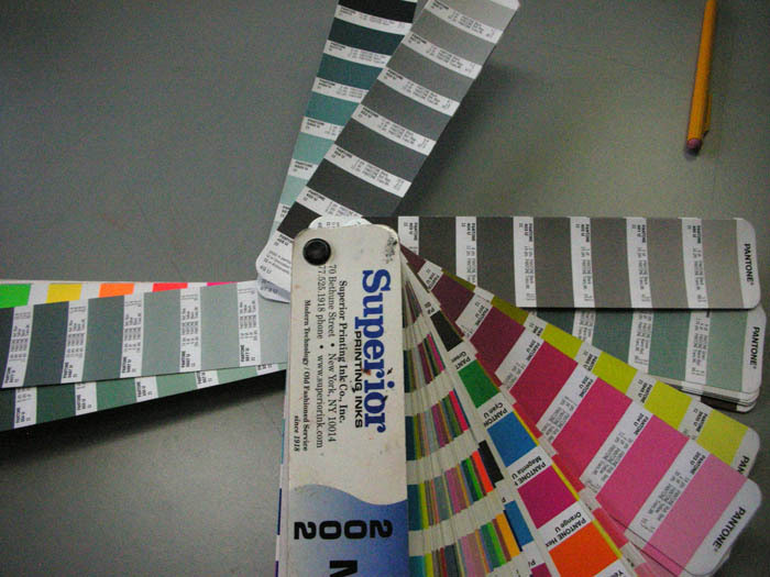
I had no idea any color on Pantone is pretty much be mixed from generic print ink


The Influentials process 4

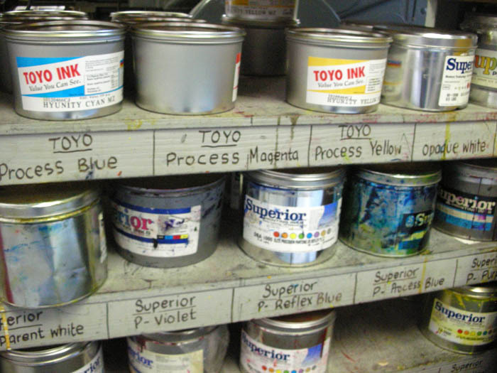
inks, inks, pretty but stinks.


The Influentials process 5

cleaning the plate before printing


The Influentials process 6

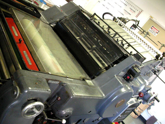
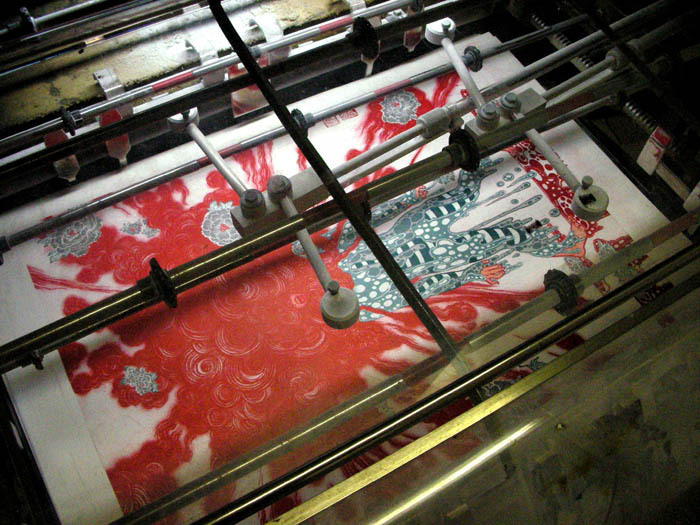
Very old fashioned offset printer. It is a machine, but the result depends on how the master printer adjust the machine according to the image as well as the weather of the day and other factors.


The Influentials process 7

color getting printed…


The Influentials process 8

Amanda checking the alignment. Minor adjustments are made often.


The Influentials process 9

almost there.


The Influentials process 10

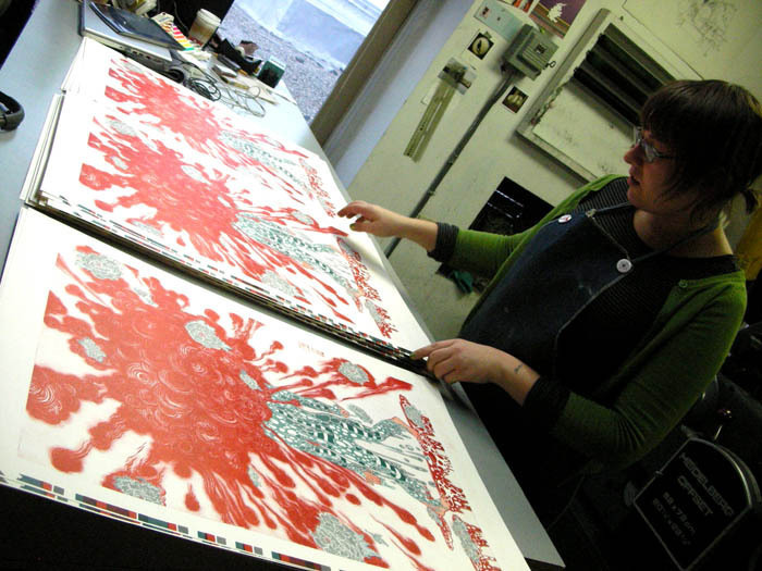
final prints finished on the machine.


The Influentials process 11

This is the beauty of the print that never exist in digital output. White dots are printed last with white ink. To make the color crisp, white was printed twice. For 6 color separations, print was pulled 7 times for the result.


The Influentials process 12

Done! Yay! Amanda, you rock.


The Influentials process 13


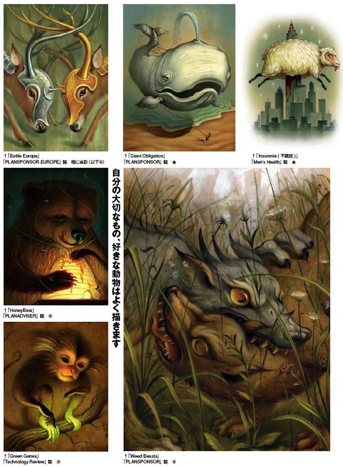
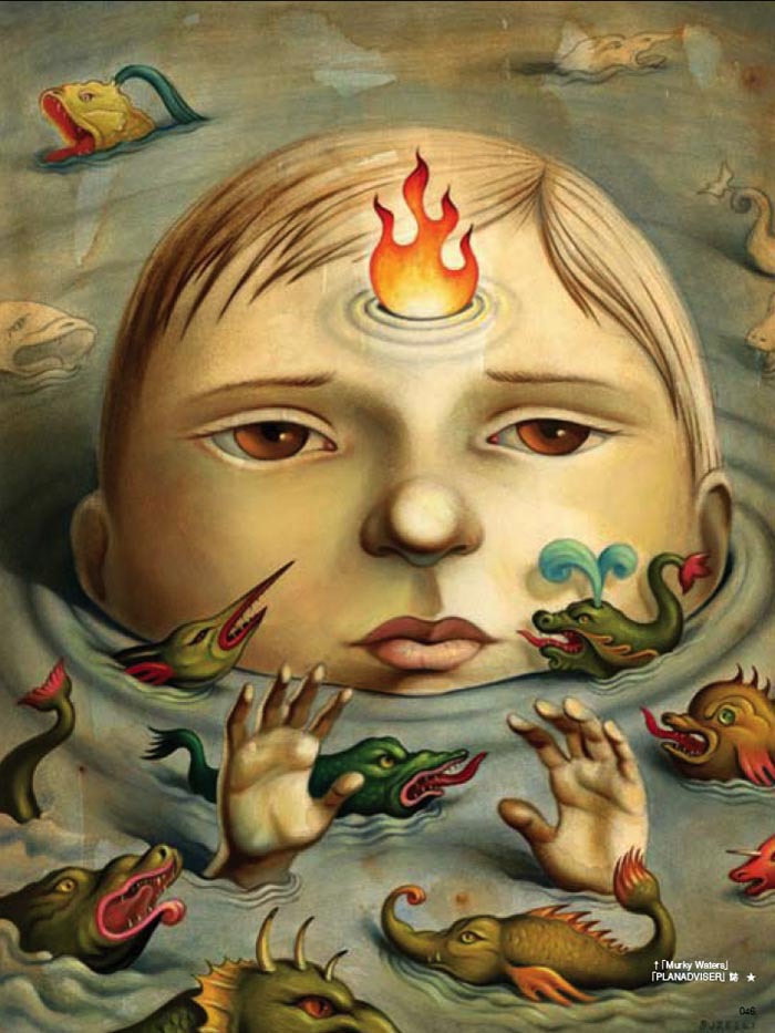
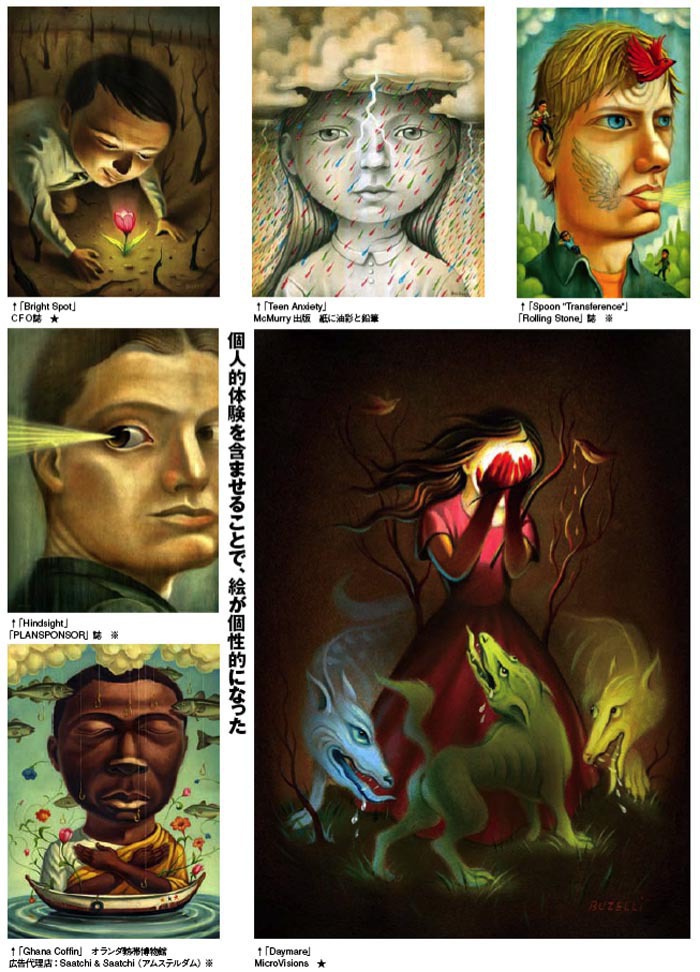
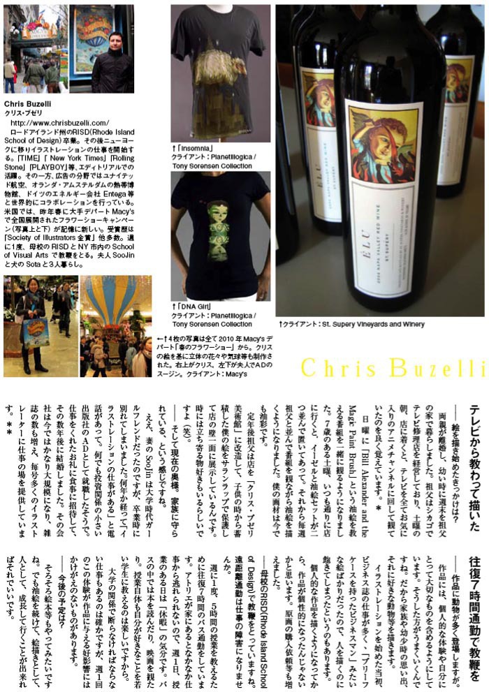
Chris Buzelli interview

Labor Day is quickly approaching, and it is time for another school year. All the art kids out there, wanna read something that inspires you to kick start another year of art filled life?

This interview article of Chris Buzelli for Japanese magazine イラストレーション(=Illustration) was published a while ago, but I hadn’t had chance to post in the timely manner. Now is the time.
For English version of unabridged original interview, please check out Illustration Friday (thanks to Penelope Dullaghan!).  If you happened to read Japanese, the actual article is on this post.

PS: I still have Sam Weber and SHOUT interviews to post soon. And I am currently interviewing Brian Stauffer. Stay tuned!!!

Chris Buzelli illustration 1


Chris Buzelli illustration 2


Chris Buzelli illustration 3


Chris Buzelli illustration 4


Chris Buzelli illustration 5


A Big Personal Work

A Big Personal Work“how do you find time to work on your personal work?” I get asked this a lot from students.
I don’t, and I don’t.
I know, this is probably not the answer aspiring illustrators want to hear.
One of the reasons is that luckily, there are enough clients who call me for what I naturally do well, so I have enough jobs where there is a lot of freedom.
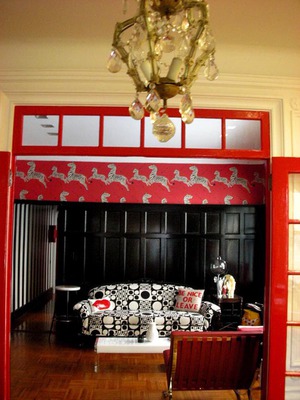
And another, and more important reason is, because I want to try out different things. Essentially, I am doing personal work, personal experiment, but it does not need to come out as ‘illustrations I do for myself’.One of the example is creating my own living environment. I had worked on this for last year and half, putting in as much effort, research, work and passion as I do to my illustrations.
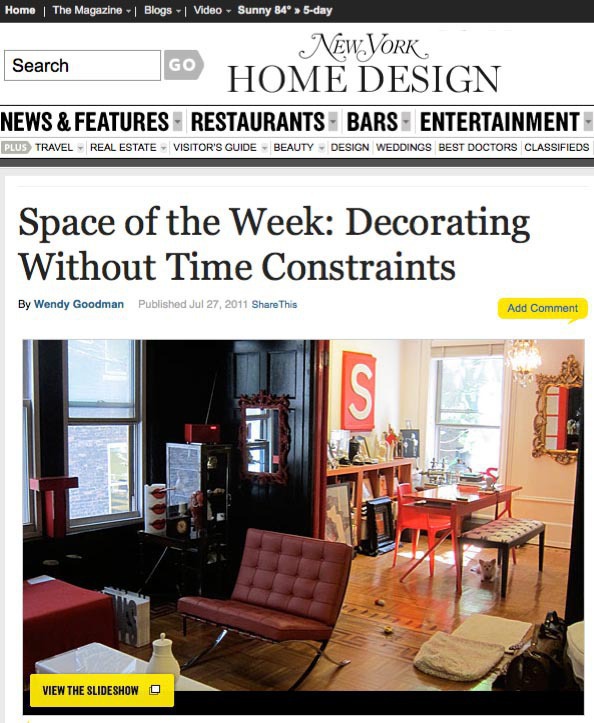
Trust me, I used the same idea I use for illustrations: There are compositions, rhythm, color scheme, positive and negative spaces, dense and sparce….Today, New York Magazine‘s interior blog SPECE OF THE WEEK featured this big personal work of mine.
When you have a moment, please take a look…
When I moved to New York in the summer of 1999 with a student visa, I had no money other than savings from my previous corporate job, which I needed to live off for the next four years in school. I bought all my basic furniture from a guy who was moving out of a room I was moving into.I ended up schlepping the furniture around for next ten years, to various apartments all over New York City.

A year and half ago, I finally decided I will move to a “permanent address”, and start everything  over again from scratch.
When I moved to my current apartment, I asked my moving truck to stop by to the Salvation Army, and dropped off almost all my furniture off. (except my red  Barcelona chair which I treated myself with after I finished a painfully torturous advertising job a few years back). I didn’t even have a mattress, and had to sleep on an ottoman bed in the living room for the first few month. Then I slowly build the apartment to where I really wanted to be.
I am really excited my favorite magazine thought it was worthwhile featuring about.

A Big Personal Work: New York Magazine
Big thank you to Wendy Goodman and Leonor Mamanna of New York Magaizne, and everyone who had helped me to make the apartment the way it looks now.

A Big Personal Work: Interior 3

The apartment is stil work in progress. The couch took a year and half of back and forth between Spruce Austin down in Texas. It finally arrived just a few weeks ago. (I had a ‘couch arrival party’).

A Big Personal Work: Interior 2

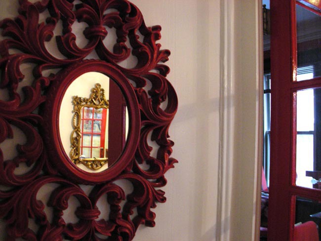
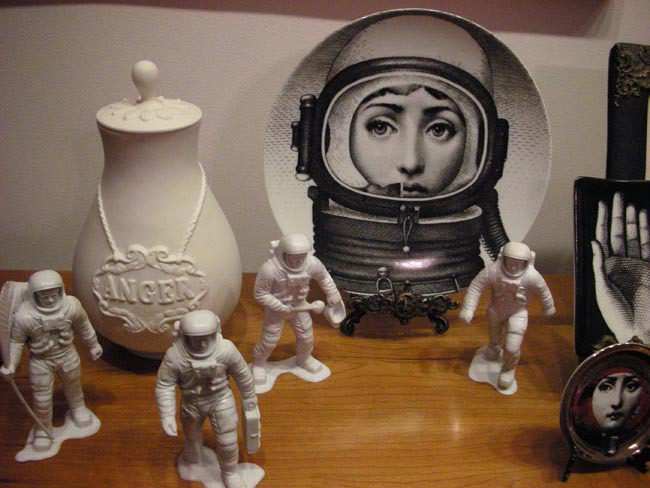
Many of the decorating items are bought from etsy, some from ebay, and some are purchased during my many travels to many cities mostly during school visits. I try not to forget to stop by to local antique stores and flea markets.

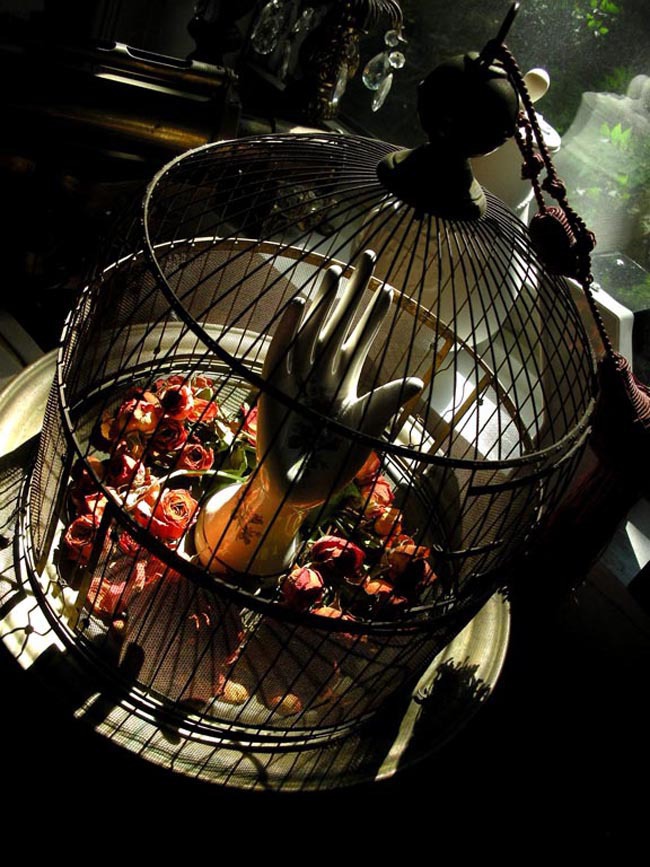
Apartment is actually still in progress. The last photo was taken this morning. A friend gave me a beautiful baby rose bouquet for my birthday, and somehow it just turned itself into a perfect dry flower. So, I decided to decorate my vintage birdcage with the roses. Looks eery cool. Well, at least, that’s what I think!

A Big Personal Work: Interior 4

San Diego Comic-Con

San Diego Comic-Con 1

I am not at Comic-Con.
Many people asked if I was going, including my DC Comics Vertigo editor Karen Berger, with whom I work monthly on covers for their (ahem, bestselling, woo hoo,) series called The Unwritten.
This year, I received my first (hopefully not last…) nomination for Will EisnerAwards in best cover artist category. I am just happy and honored that enough people thought my work deserved a nomination. I don’t want to think about wanting to win, which I may feel, if I was in San Diego.
I rather stay in New York, finish up piled up work before heading out to Italy early next month to teach a week long workshop.

BUT, that does not mean I am not present at Comic-Con.
In fact, I am participating in a one night charity auction event curated byCreterion Collection for Japan earthquake relief.
Creterion Collection puts out beautifully packaged collectors edition DVDs with edge, working with many illustrators. I remember dreaming of working with them when I saw a gorgeous package designed by Josh Cochran a few years back.


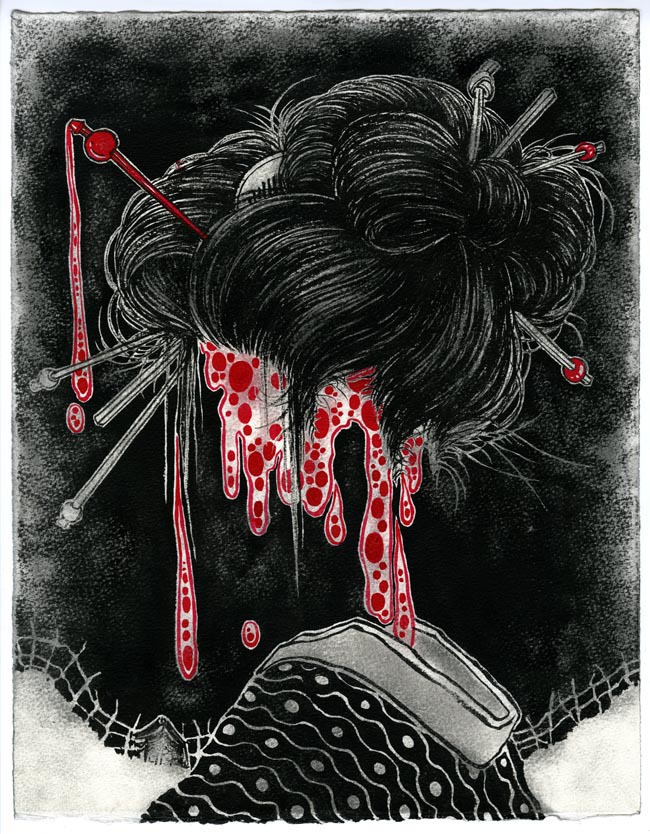
Eric Skillman of Creterion Collection has curated an auction show of Akira Kurosawa’s works interpreted by various illustartorsincluding Josh Cochran and myself. All one of a kind originals.  Proceeds will be donated to Japan Society Earthquake Relief Fund.

So, if you are at Comic-Con, head out to San Diego Wine and Culinary Center across the street from San Diego Convention Center. Friday July 22, 7PM to 1AM. And Buy art for a good cause!!


A TRIBUTE TO THE FILMS OF AKIRA KUROSAWA
A benefit for Japan Relief, presented by The Criterion Collection and Tr!ckster

Tr!ckster is being held at the San Diego Wine and Culinary Center,  200 Harbor Drive, San Diego. A Tribute to the Films of AkiraKurosawa,” is one night only, Friday July 22, 7:00 PM to 1:00 AM.
 

San Diego Comic-Con 2

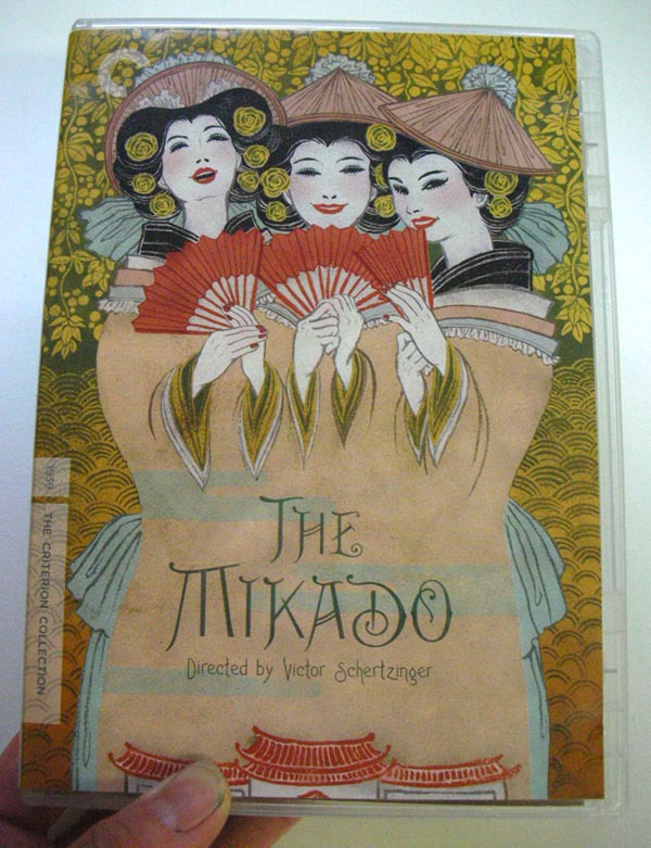
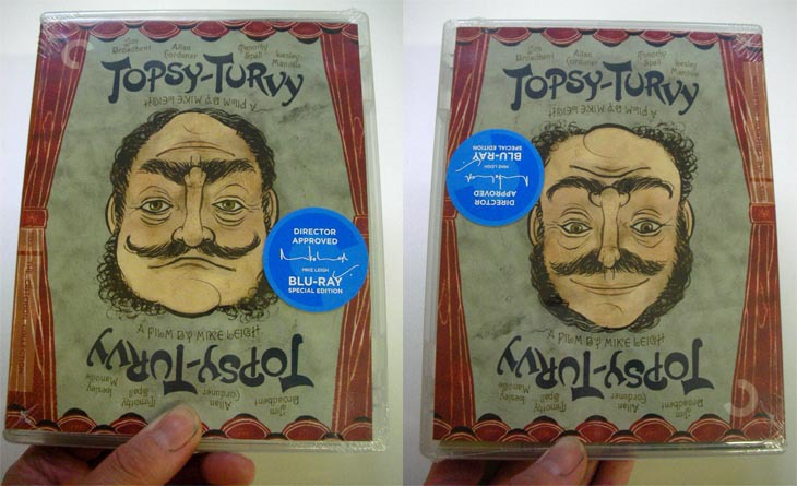
These are DVD packages I worked with Criterion Collection. The Mikado is an opera-film, and Topsy-Turvy is another film about two men who were behind created the opera Mikado. It was fun to work on both covers simultaneously.
 

San Diego Comic-Con 3

San Diego Comic-Con 4

Topsy-Turvy, like the title, has the upside down heads of two main characters. It was a tough job to draw both of their portraits on one head and make them look like the actors. Eric helped me a lot with the process. I am happy with the result.

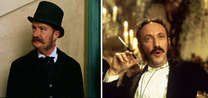
Below are the actors in the film.


San Diego Comic-Con 5

my piece is based on Akira Kurosawa’s “Donzoko (The Lower Depth)” 11.25′ x 14.5″ black and red ink on watercolor paper, 2011


Below is the press release

A TRIBUTE TO THE FILMS OF AKIRA KUROSAWA
A benefit for Japan Relief, presented by The Criterion Collection and Tr!ckster

TR!CKSTER and The Criterion Collection <http://www.criterion.com/>  have joined forces to curate a one-night-only celebration of the works of legendary director Akira Kurosawa. Cited as an inspiration to generations of storytellers, Kurosawa’s films resonate with a singular clarity of vision, and his images last in our minds long after the last frame has played.

This intimate show, curated by Criterion designer Eric Skillman, will feature original pieces by artists from the worlds of comics, animation, and illustration, including: Mike Allred, Scott C., Josh Cochran, Francesco Francavilla, Robert Goodin, Victor Kerlow, TedMathot, Scott Morse, Sho Murase, Yuko Shimizu, Bill Presing, Jim Rugg, Bill Sienkiewicz, and Connor Willumsen.  Though the gallery show will be free to enter and enjoy for the general public, all proceeds from sales of these works will be donated to the Japan Society Earthquake Relief Fund. <http://www.japansociety.org/earthquake>
This is a special engagement gallery event, existing for one night only: Friday, July 22, 2011.

Tr!ckster is being held at the San Diego Wine and Culinary Center, which is a venue across the street from the San Diego Convention Center where Comic-Con is being held. Its address is 200 Harbor Drive, San Diego. Our show, “A Tribute to the Films of AkiraKurosawa,” is one night only, Friday July 22, 7:00 PM to 1:00 AM.
Brian Rea interview

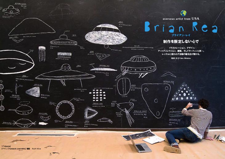
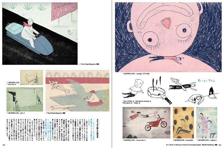
I have been interviewing fellow illustrators and introducing them to Japanese audience through ILLUSTRATION Magazine (イラストレーション) for about two years now.
The new issue just came out. This was the first issue after the huge disaster in Northen Japan. The request from the editor in chief was that they wanted to introduce someone who’s work is heartfelt, sweet and touching. Possibly bring smiles to those who are going through tough times. We both thought Brian Rea’s work was perfect.

As usual, for those who cannot read Japanese, Illustration Friday was kind enough to post the full length unabridged English version on their site.


Brian Rea 1

I recommend this interivew to particulary those who recently finished school. Brian talks about his process of getting over style and decoration, importance of sketchbooks, and having passion outside of art, among other things.

I had been extremely busy last half a year or so, and there still are interviews to: SHOUT, Chris Buzelli and Sam Weber that is waiting to be posted on Illustration Friday. I will let you know once they are up on the web.

Brian Rea 2


Brian Rea 3


Brian Rea 4


Brian Rea 5

Buy Art For A Good Cause

Weather in New York is finally neither boiling hot or cold. So, come out to SOHO this Saturday afternoon, and buy art for a really good cause.
My good Japanese artist friends who live and work in New York, have spend months organizing this one night charity art show Dear Japan. All the proceeds will go to Japan Society’s Japan Earthquake Relief Fund” (David has posted details earlier too).
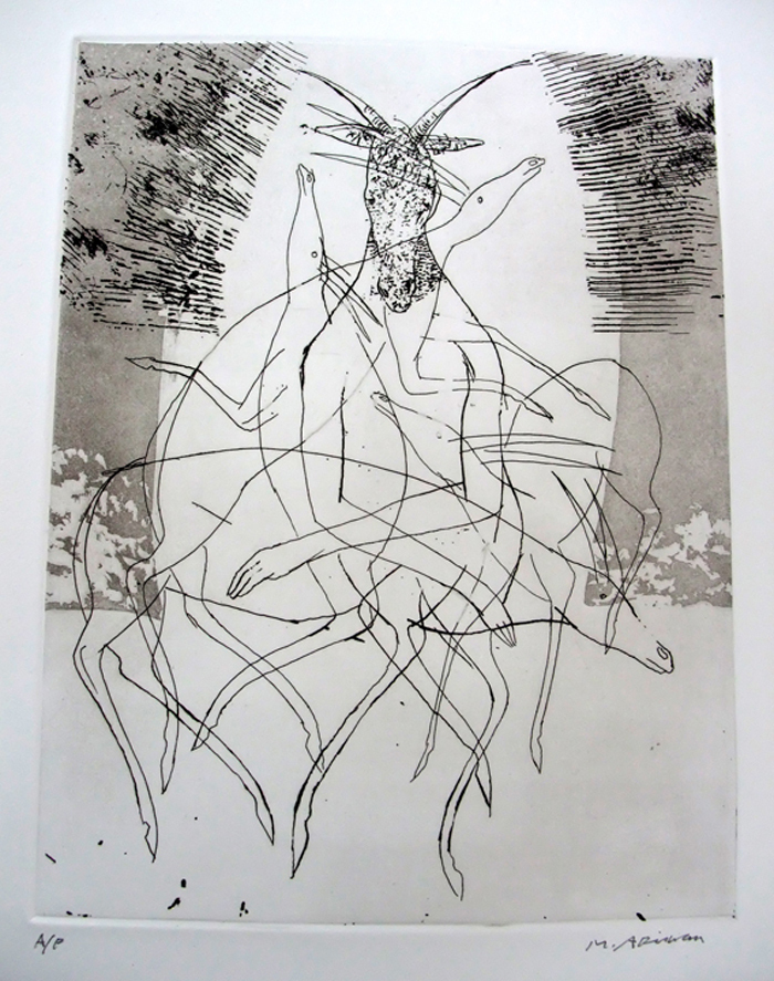
170 illustrators and fine artists are participating in the show, and most of them are selling art for a fraction of what they normally sell them for. Everything for sale at the show is $200 for less. Yes, even an original Marshall Arisman print!

Dear Japan Illustration

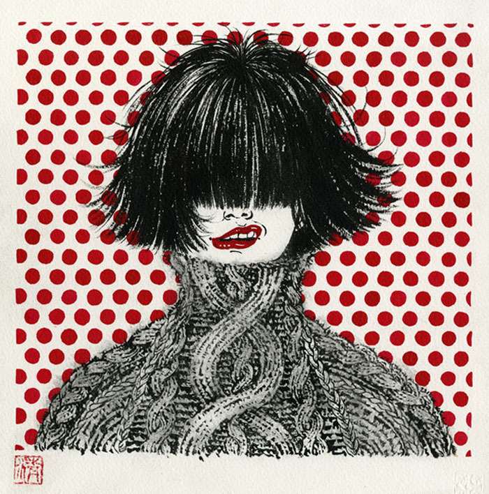
my piece: Red Dot Meditation black and red ink on watercolor paper 10″ x 10″ framed

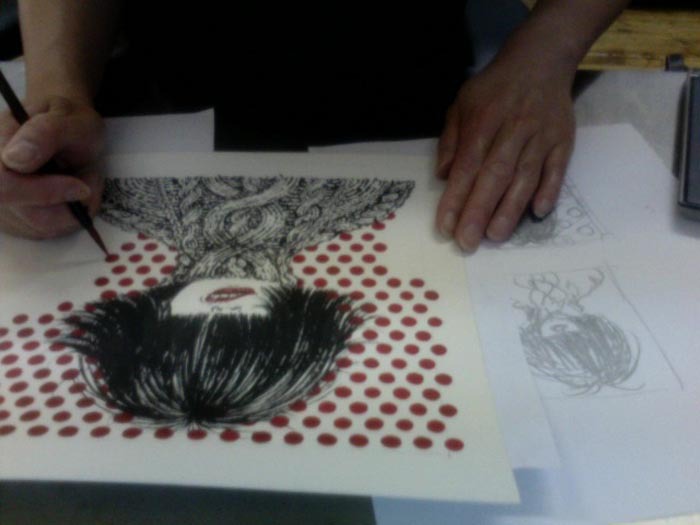
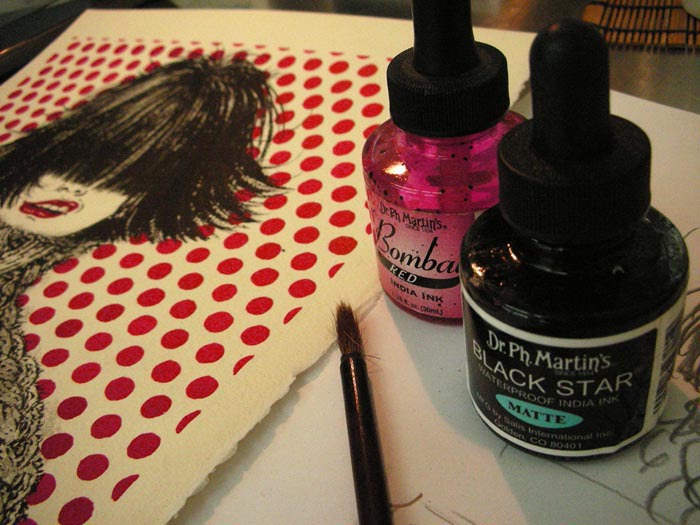
I took time off from jobs yesterday, and created a 10″ x 10″ drawing using black and red ink. Since it is not for print media, I have decided to make it all about different textures subtleness of which can only be seen if you are looking at it close enough. All the red dots that may seem like a computer generated pattern are drawn by hand using red ink one by one. This drawing is framed and ready to be on your wall. Hope someone can take it back home with him/her on Saturday night.

Dear Japan Illustration process


Dear Japan Illustration process 2

I have also picked some of my personal favorite from the show.  More exciting works can be seen (and purchased) at the show. Hope to see you on Saturday!


Art Connect New York Gallery Space: 491 Broadway, 5th Floor New York, New York 10012
June 4th, 2011, Saturday 4-8 PM
Purchase by cash or checks

more info on Dear Japan Blog: http://dearjapanny.wordpress.com/


Dear Japan 1

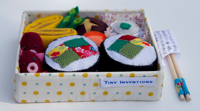
by Tiny Inventions


Dear Japan 2

Dominc Rapone silk screen


Dear Japan 3

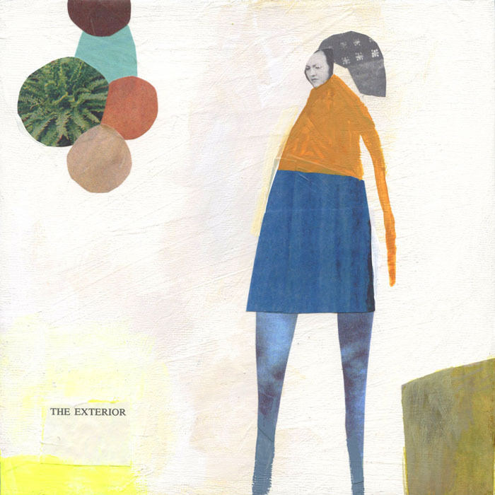
Elena Wen


Dear Japan 4

Tomoko Sugimoto


Dear Japan 5

Will Varner


Dear Japan 6

Marshall Arisman


Dear Japan 7

Katherine Streeter


Dear Japan 8

Oliver Hibert


Dear Japan 9

Ciou


Dear Japan 10

Keiko Tokushima


Dear Japan 11

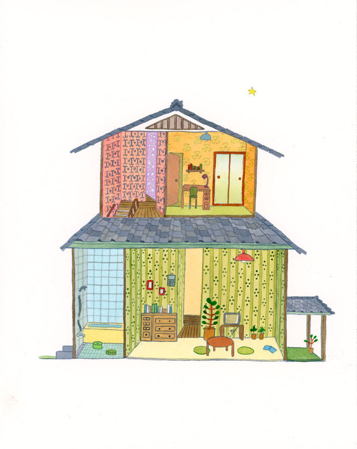
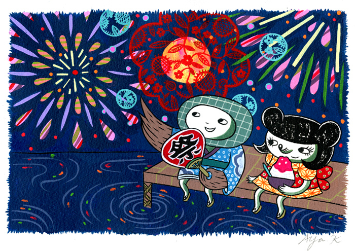
Aya Kakeda


Dear Japan 12

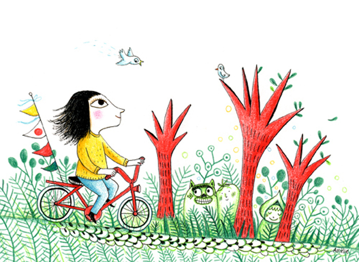
Dufor Amelie


Tequila!

Many of my drawings appear on the pages of magazines and newspapers. They get read, and go into recycles in a week, or a month, or in the case of newspapers, in a day at the most.
I am very much in peace with it. In fact, I feel that it keeps the artists humble, and down to earth. There is nothing pretentious about drawings that goes to garbage bin in a day. I like that.

But of course, every once in a while, when some special project comes knocking on the door, and they are beautiful 3D objects. Now, that is nice too. And exciting.

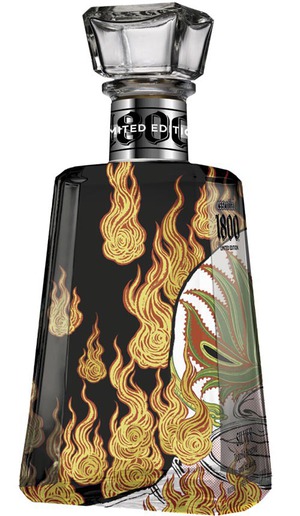
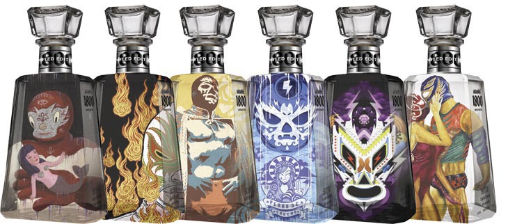
Close to a year ago, I had a chance to create a drawing for 1800 Tequila’s limited edition Essential Artists series, in theme of Lucha Libre. If you know me, you know my passion for all things Mexico, so it was a really exciting opportunity for me.

The product finally got the official release on Cinco De Mayo, last week on May 5th, at Hudson Hotel in New York City during a release event that was organized by 1800 Tequila and Vice Magazine. There are five other bottles in this series from different artists in various style..
The Essential Artists 1800 Tequila should soon come out to  fine liquor stores near you.

Tequila bottle photo

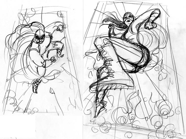
Rough pencil sketches to start the project.

Tequila sketch


tequila sketch 2

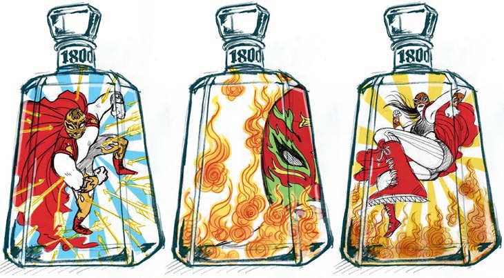
sketches for three different bottle ideas. I put them in a drawing of the bottle to show how they may look finished. I liked the other two as well.


Tequila illustration

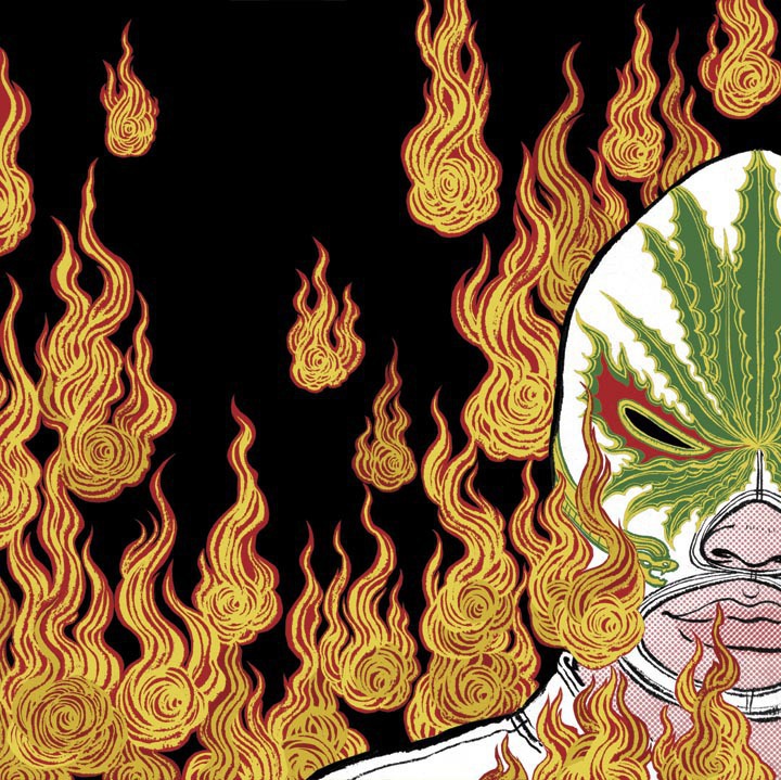
final drawing for the bottle. Since the image is printed directly to the back of the glass, I kept the drawing simple, not textures and no shading. Pretty smooth finish. The mask has the design of agave: the plant that tequila is made from.
Tequila photo 1
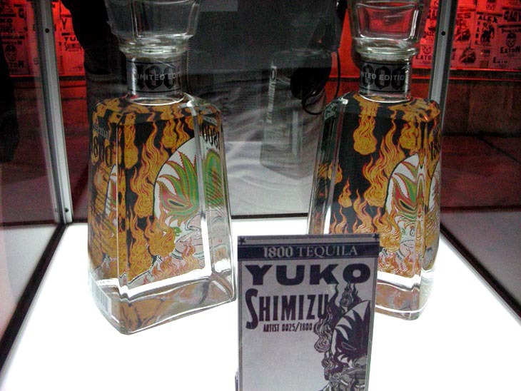
my bottle in the showcase box at the release party last week.
Tequila photo 2
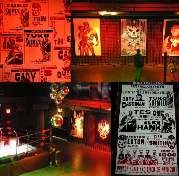
All the bottle designs in this series. From the left: Gary Baseman, mine, Tes One, Tristan Eaton, Ray Smith and Alex Hank
Tequila photo 3
 Some photos from setting up of the party. There was a ring in the center stage where band and actual luchadors played, and blown up huge drawings up on the walls surrounding, with posters made to look like Mexican wrestling posted around the bar area. There was a huge turnout for the party with a long line of people waiting.

13 Assassins

13 Assassins small image

Japanese people take “new year” very seriously and are superstitious about “first” anything to predict how well the year is going to be. For example, “first dream of the year” is believed to be the best if you have dreamt of 1)Mt. Fuji 2)hawk 3)egg plant. Why egg plant? Not sure. But I am not making these up!

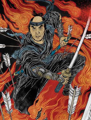
In this long, cold and snowy winter in New York, my work day started on January 3, Monday. Sunny. My first job of the year was to walk down toMagnolia Pictures office near my studio for the screening of an epic 2 hour + long new samurai film 13 Assassins directed by Takashi Miike, who is very popular with his horror films such as “Ichi The Killer” and “Audition“. The project wa to create a poster. Now, if this ‘first job of the year’ would predict my 2011, then I have to say I had an amazing start of a year.

On and off for about two month, I worked with Matt Cowal, VP Marketing/Publicity of Magnolia Pictures. I have to say I had such a fun time working on this.
The main actor of the film is Koji Yakusho, who played Miyamoto Musashi in a popular Japanese TV series in the 80s, which I was obsessed as a kid. And I get to draw him! Now, this didn’t happen even  in my “first dream”. My dear friend and illustrator/calligrapher Ai Tatebayashicontributed beautiful lettering for the poster design.


Find more about 13 Assassins and watch the trailer here. 13 Assassins will be released in the theaters next Friday, April 29th.


13 Assassins process 1

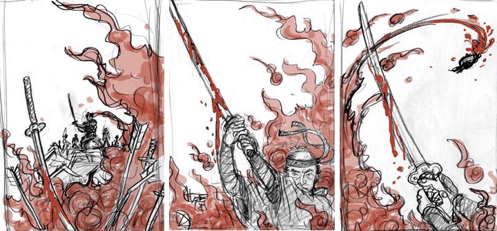
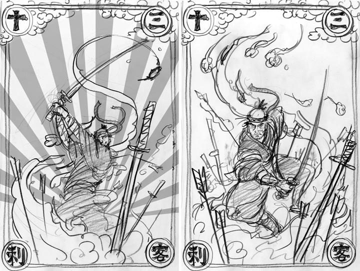
first set of sketches. They were little bit too ‘art house film’ approach, which would have worked if the audience was Japanese. We decided to go a bit more ‘samurai action film’ approach.


13 Assassins process 2

The second rounds. Sort of Tadanori Yokoo take on the samurai action approach. We decided to go with the right.


13 Assassins reference photo

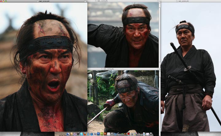
Although Koji Yakusho’s face may not be as recognizable here in the States compared to Japan, likeness is important. I got tons of great photo references from the clients. I usually open them up on my large monitor as I draw.
 

13 Assassins process 3

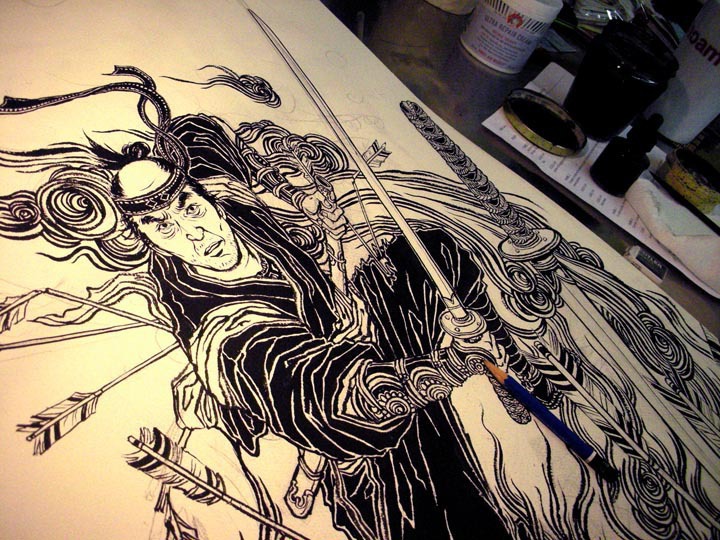
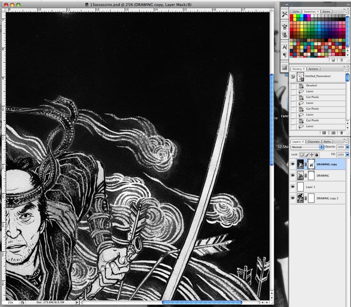
Drawing in progress. paper size is about 22″ x 30″. Ink on watercolor paper.
 

13 Assassins process 4

then move to coloring on Photoshop. Although colors are relatively limited and simple, it took days and days of separating and adjusting the details and colors. File size can get quite big for poster jobs… I need to buy a new MacBook Pro soon…


13 Assassins process 5

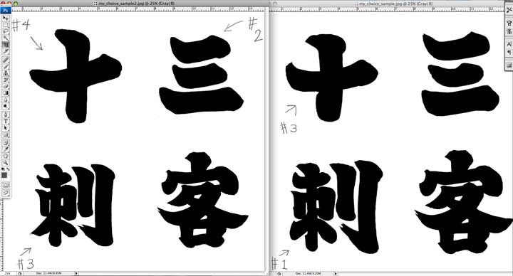
Yes I could have done lettering myself, but I also believe in the power of pros. I asked my friend and illustrator/calligrapher Ai Tatebayashi to create those four letters for me. We discussed carefully, the direction of the lettering style, thickness of the lines, etc. She did the perfect job!!
13 Assassins final
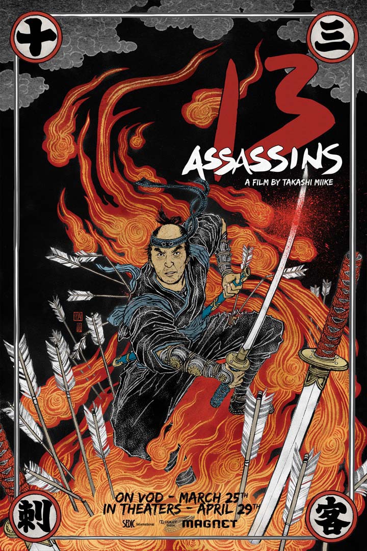
Final poster design.
13 Assassins posters
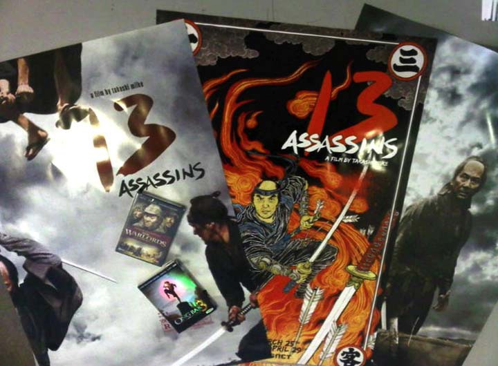
There are three posters for the film. Hope I get to see mine somewhere… if you do, please take photos for me!
Before we go, let’s talk about things that gets me in the ‘mood’: i.e. Reference materials.
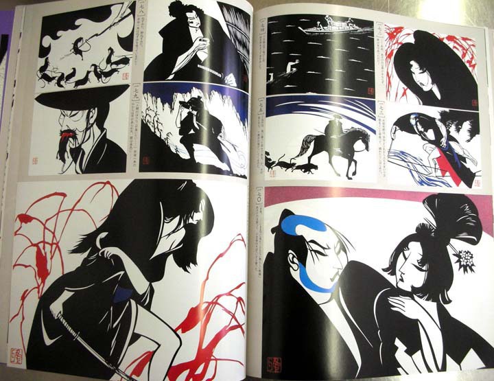
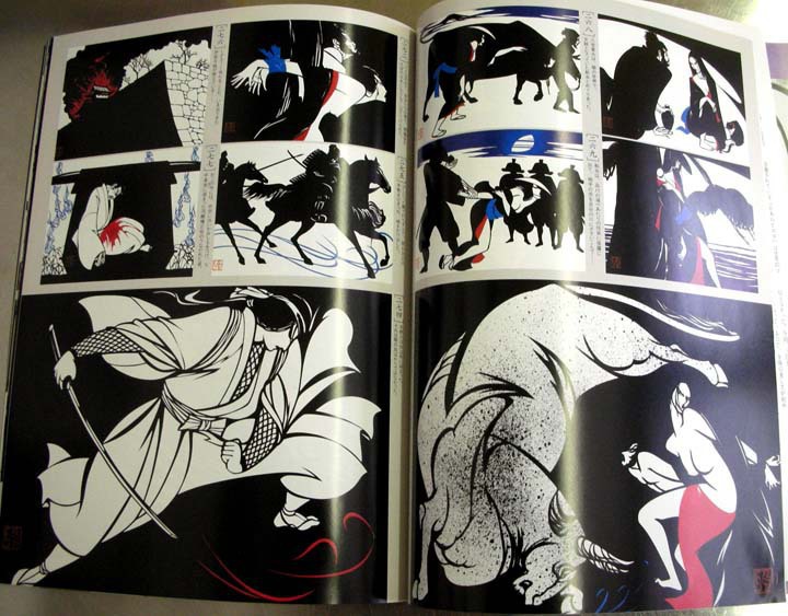
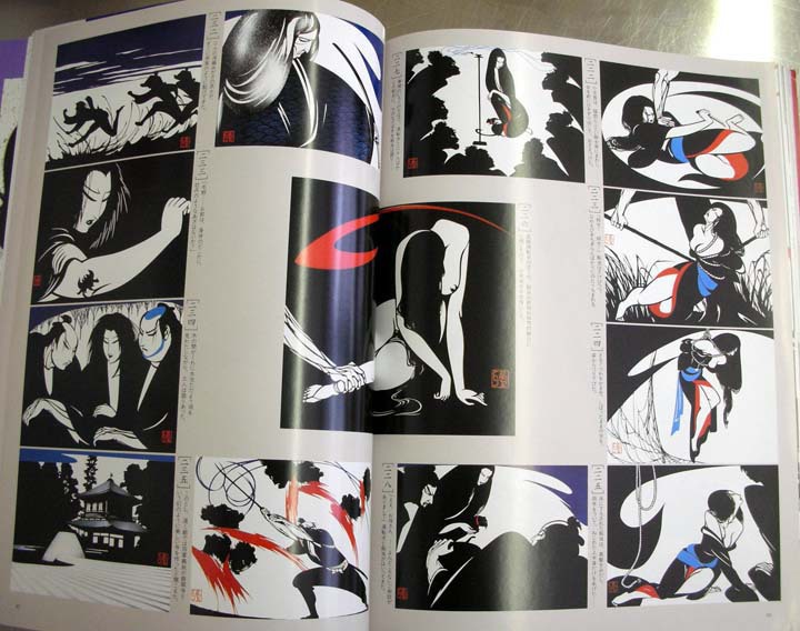
There were of course, a lot more things I had looked at, of course,  but these three are staples when I work on samurai theme. From  left, Heroes & Ghosts Japanese Prints by Kuniyoshi. I initially bought this book for my first job for Rolling Stone Magazine years ago, and have been heavily referencing since.  Center is a book of art by Kawanabe Gyosai. On the right is relatively contemporary Miyata Masayuki’s papercut illustrations that accompanied Eight Dogs’ Tale by writer Yamada Futaro, which was initially published on Asahi Newspaper in early 80s.
Miyata Masayuki is not well known outside of Japan, but he was a genius. I wanted to share some of the pages from this book.
13 Assassins references 2
13 Assassins references 3
13 Assassins references 4