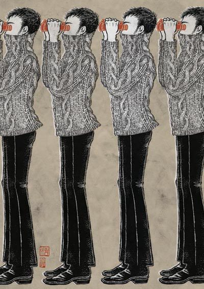
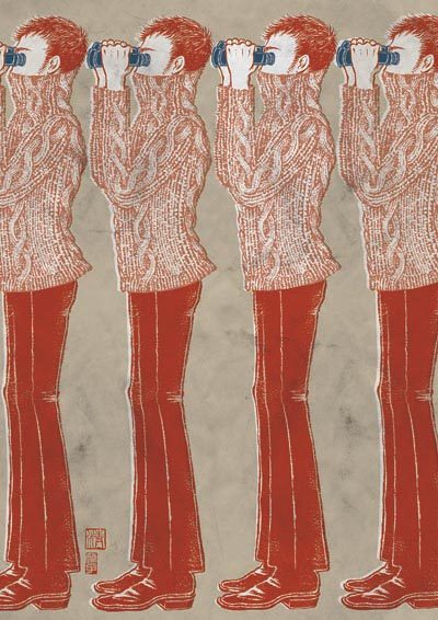
I came up with an idea in two color schemes, after a long period of communicating back and forth with the curators, and some help and advise from artist friends.
I actually personally liked the black version better, but at the end, the curators went with the red one for the practical reason of adding type to the finished poster
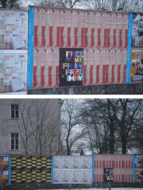
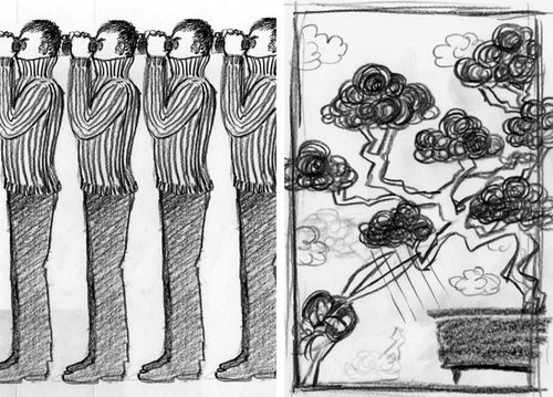
Most of us, illustrators, are used to seeing our work in magazines, newspapers, on book covers, etc… a lot smaller scale. It was a refreshing experience to see these photos of my work in a larger scale. A friend just sent them to me from Berlin. Curators decided to put the posters together, so they make illusion of never ending line of everyone watching everyone.
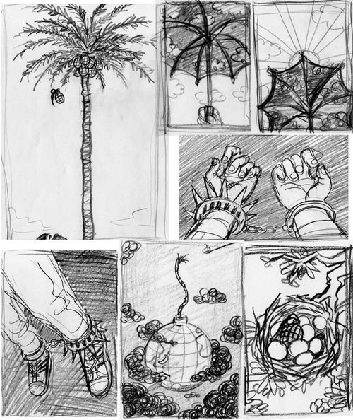
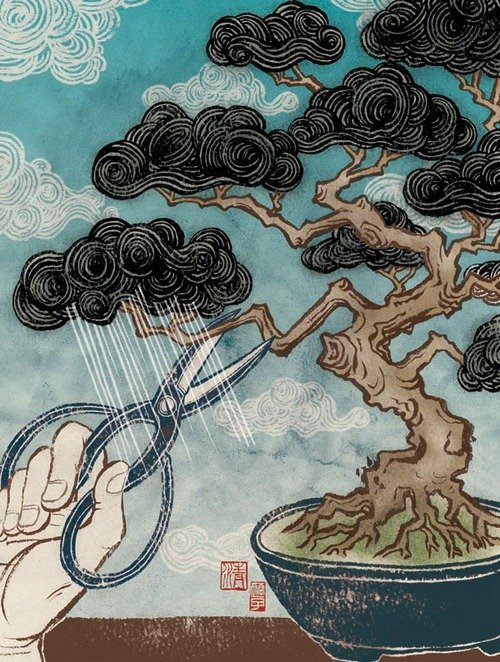
And here are some sketches. Some worked, some didn’t. Also interestingly, some would have worked in editorial context or domestic use, but once the context was taken out of publications and/or the border of the US, all of a sudden some started having different meanings which made them not work. It was definitely an interesting topic to work with. I am fully aware that some of the sketches here are not good at all. But hey, I have no secret. I wanted to show them anyway, just to share especially with aspiring illustrators. Yes we do sometimes come up with really bad ideas first to reach good ideas at the end. Fair?


