 People often ask me if I have time to do some personal work in between illustration jobs. While a lot of my peers have straight answer of ‘yes’ or ‘no’, mine’s more like, well, in between.Everyone has different balance of jobs, personal work, and recharging. I draw all the time, so for the last few years, when I am not working, I rather use that time to recharge (=not draw) so I can get inspired so that I can create more in the future.
Then, where doe my personal creative outlet go?
I luckily have a few clients who let me experiment, and create work I would rather be creating during my free time (if I have any). And here it goes back to today’s post: Creative director SooJin Buzelli of PLANSPONSOR and PLANADVISER magazines as being the queen of that.
This is the most recent project I just finished for her. Both of the magazines focus on highly specialized and specific financial topics, SooJin knows how to get the best and most creative ideas out of illustrators by providing only the topic (sometimes just the title) of each article. This article’s topic: listening and processing different pieces of advise.
You can see the whole magazine including other illustrations in this issue online.

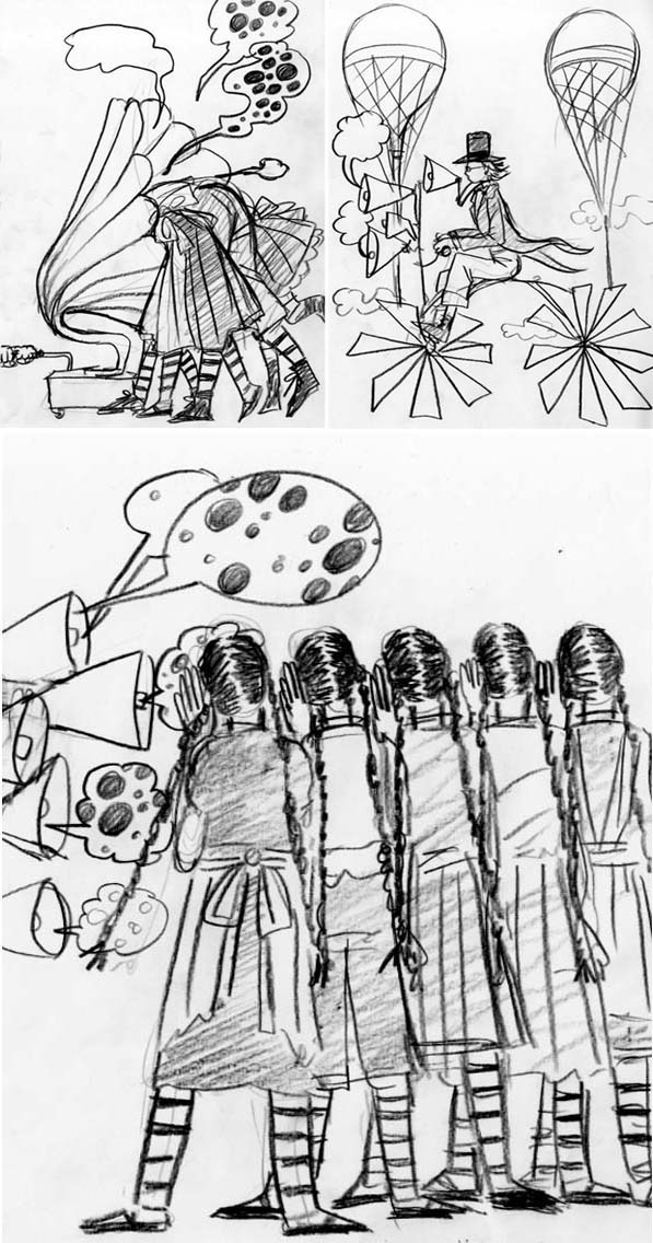
Three ideas submitted. I liked the top left and the bottom. She seems to always know which one I am most excited about.
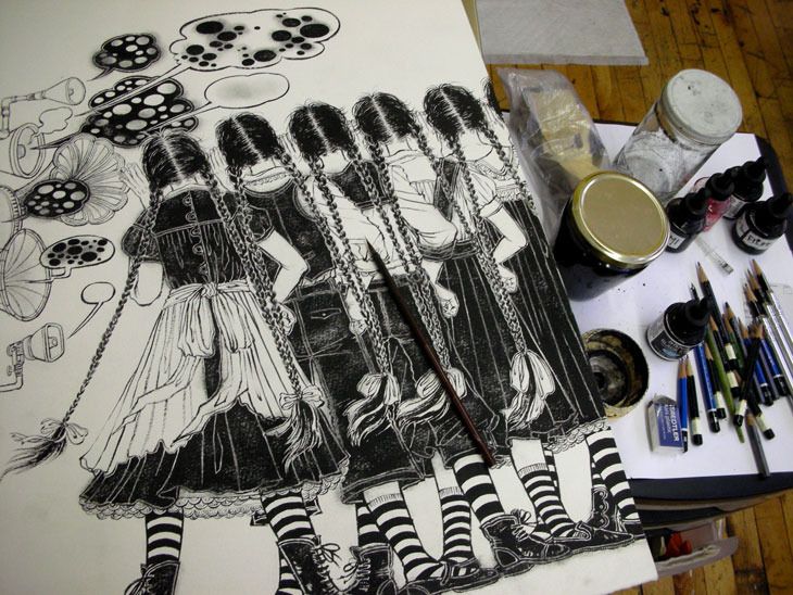
Black and white drawing with ink on watercolor paper. Rather large, as you can see…

I have a lot of books I use for color references. For this one, I wanted to use old fashioned limited color palette, so I pulled out a Japanese book of old Russian childrens books. Bottom right was my big inspiration for this piece, although the final color scheme is a lot different. By the way, this is one of my favorite books to use for color scheme references. In case if anyone is interested, the book is called: 幻のロシア絵本 1920-1930年代 publisher:淡交社 ISBN4-473-03166-7 http://bookweb.kinokuniya.co.jp/guest/cgi-bin/wshosea.cgi?W-ISBN=4473031667

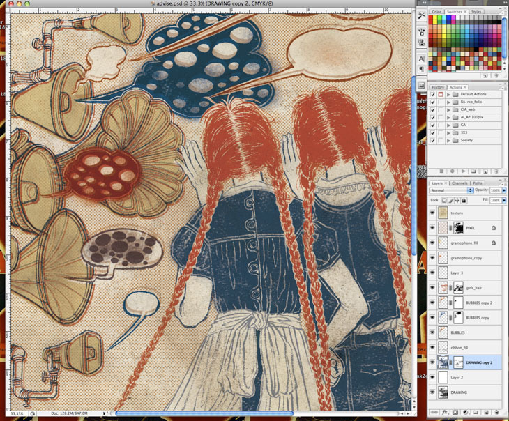
Screen-shot of Photoshop coloring in progress. Yes, I have added the dot pattern inspired by the Russian illustration.
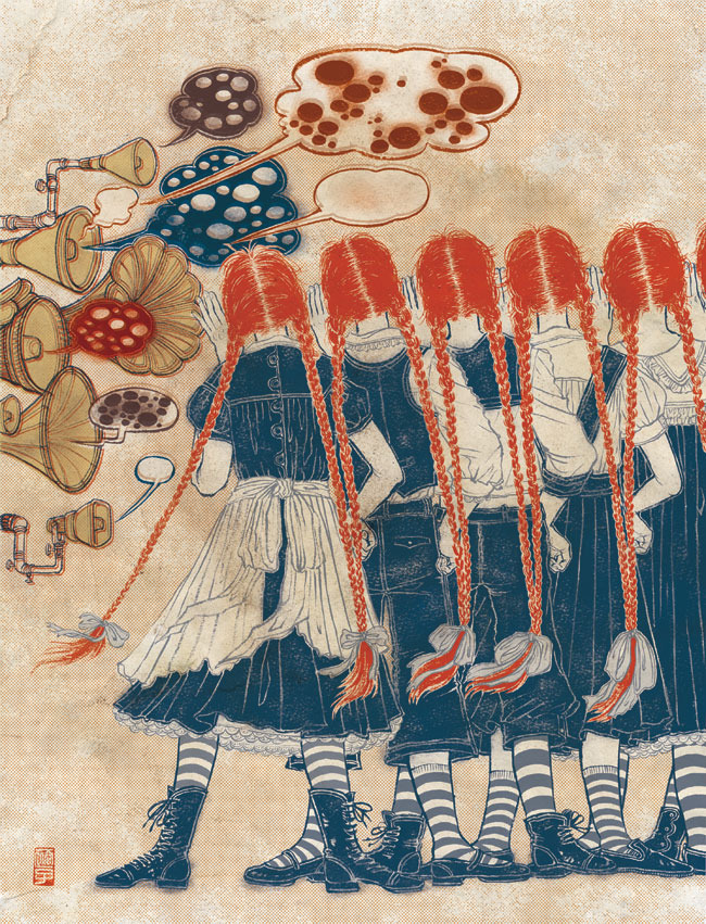
Final illustration, done!! If I have a choice, I rather limit the colors like this every time I work. I am not crazy about coloring in every single space of the drawing. But of course, each illustration is worked on each specific needs.

Final layout. How clever of SooJin to have the type in the same size of the heads continuing onto the right page. So simple. Love it.

Cover of this issue of Planadviser. Each letter has fragment of interior illustration in it. Cute.


